JUVO Sports
Brand Identity
Juvo Sports is a Singapore based sports company that provides sports and training mainly in Wushu and Taekwondo.
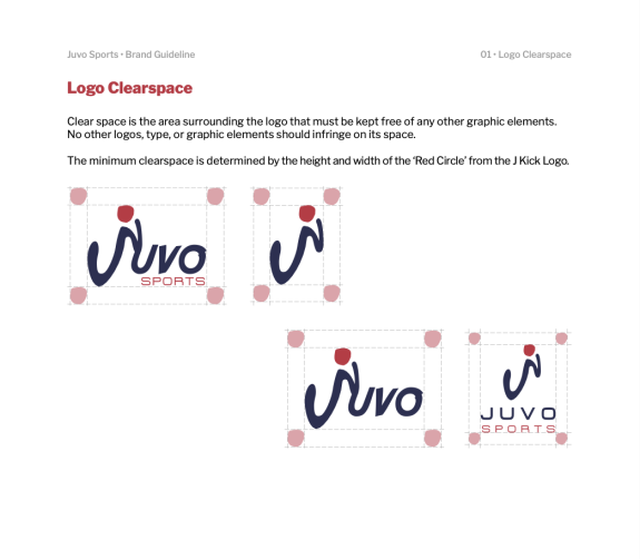
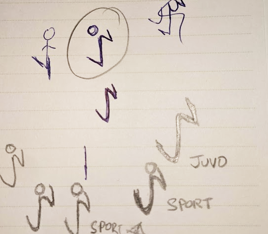
We embarked on the comprehensive branding process by initially conceptualising the logo, with a focus on crafting a design that not only immediately conveys the essence of the brand but also ensures easy recognisability while making sure that it can be apply across various mediums.
The logo's core element is the letter "J," which forms the central foundation of the design, followed by an inverted U linking with the letter V. The odd-shaped circle represent the letter O. Collectively, these elements cleverly evoke the image of a person in the act of kicking, symbolising the company's core mission of sports and training.


